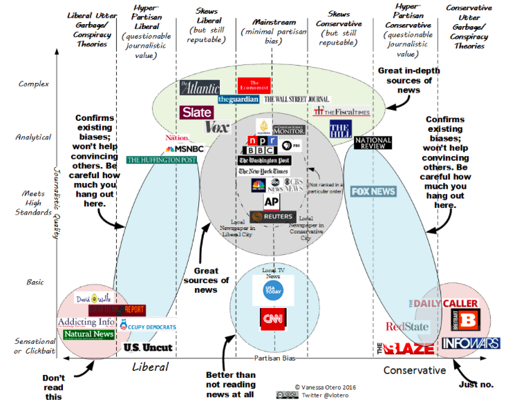
After some digging, I believe that I found the source of one of the best visuals of the year. The graphic breaks down liberal vs conservative news sources along a continuum. Right now, I don’t feel like there’s a source out there that’s really not skewed. But, this is a great conversation starter with students (and adults).
The graphic was created by Vanessa Otero, a patent attorney. You can read her process for creating the graphic here: http://www.allgeneralizationsarefalse.com
You can also get high resolution versions of the graphic at her site.
I have added two extreme news sites to my bookmarks, and I check them out when I have the energy. I am amazed by the slants both sides take on the same news articles. Sometimes I wonder how we’ll ever find a middle ground.
Your Perspective: How do you think the graphic aligns within the spectrum? How could you use this in a digital literacy lesson?